


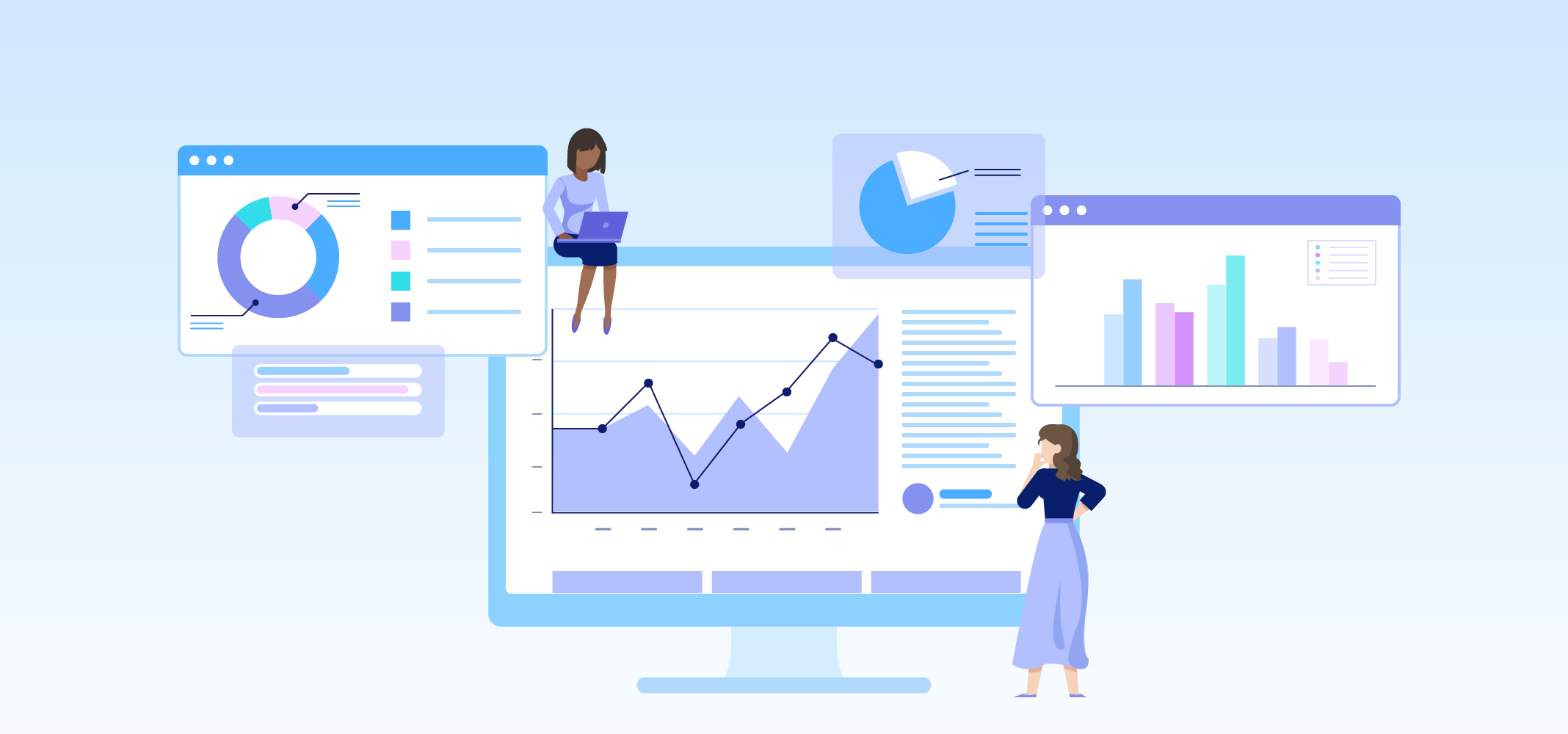
When you’re evaluating tools and systems to help you manage financial data at your school district, you’re probably focused on features, functionality, and how easy they are to implement. Whether it looks good isn’t part of your decision-making process—or is it?
Good design breeds trust. You are more likely to trust a system that seems well-designed, the same way you’re more likely to trust a shiny, streamlined new car as opposed to an old, beat-up model with dents and cracked paint. They may drive the same, but you instinctively feel the new car is safer. The systems that control your financial data should also feel trustworthy - and a well-designed product will provide that sense of security as you use it to manage your expenses, plan your budget, and allocate funds.
Accessibility of Financial Data
Design can have a major impact on the accessibility of your financial data. Accessibility typically refers to specific attributes related to users with disabilities such as color blindness, visual impairment, or motor skills disabilities; but also includes how easy it is to use the product, understand and navigate the data, and introduce to new users who may not have a finance background. In a school district, these new users may be your superintendents or principals who don’t have the same experience as your Finance department, but have an equal need to know what their current budget is in order to make decisions on a daily basis.
Data Visualization
How does design help? Data visualization makes it easier to understand and navigate your district or school’s financial data with minimal training. Discoverable design allows for interfaces to be self-explanatory and explorable. It can be difficult to unravel a complex, multi-tab spreadsheet or the text-dense output of your ERP system, but a well-designed product can help democratize access to the data and budget. This limits gatekeeping and having to rely on a few personnel (or one key person!) who know how to navigate the existing system.
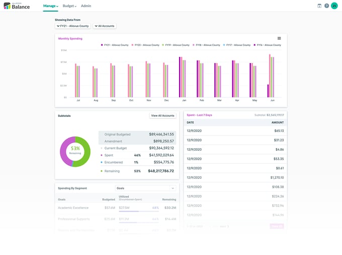
Manage transforms dense data into easy-to-interpret visuals like bar graphs and pie charts
Data visualization includes but is not limited to graphs or pie charts - it also includes organizing information to highlight specific and more relevant pieces, clearly labelling your Chart of Accounts with text descriptions in addition to number strings, and providing different ways of viewing the data, such as a high-level view versus a detailed perspective, depending on your needs. All of this contributes to making finance data both easier and quicker to understand for both new and experienced staff, saving time for everyone involved.
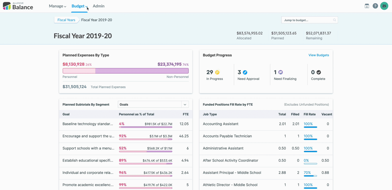
Budget uses text descriptions to enhance user experience by summarizing data
There is a principle called the aesthetic-usability effect, which was first studied in 1995 by Masaaki Kurosu and Kaori Kashimura of the Hitachi Design Center. They were computer-human interaction researchers who tested 26 variations of an ATM UI, and asked study participants to rate each design on ease of use, as well as aesthetic appeal. They found a strong correlation between the participants’ ratings of aesthetic appeal and perceived ease of use. In relation to your financial data, a well-designed product is not only easier to use, it looks easier to use. This is more welcoming to new users and makes them more predisposed to engage with the product regularly rather than relying on your Finance team for all their questions. A poorly designed product will seem overwhelming or too complicated. Even if it functions well for your experienced power users, it will discourage your new users and limit their willingness to work with it. Switching to a new system won’t help your district if the people who need it are unwilling to use it.
Data Visualization with Trends
Finally, design can benefit both new and experienced users by making it easier to identify patterns in your financial data. Data visualization can make trends more apparent than when your data is only represented as numbers in a spreadsheet. A basic bar graph can show you how much money has been spent compared to what was budgeted for the last 5 years, allowing you to quickly see that your district has historically over-spent. This suggests an opportunity to reassess your budget for future fiscal years.
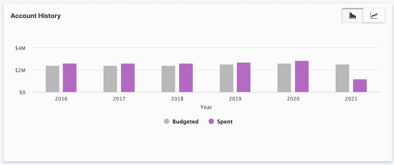
Basic graphs can tell a story with your district finances and can assist with future planning
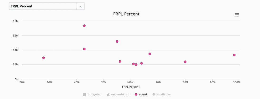
It can also help identify potential areas of concern, such as resource equity, by highlighting outliers in your data. This chart shows all the schools in a district, mapping their per-pupil spending against their percentage of Free and Reduced Price Lunch students. By drawing direct links between separate pieces of data, you can more easily compare these schools and identify areas that may require further investigation. In this example, we have one school where almost all students qualify for FRPL but the per-pupil spending is significantly lower than a school with a much lower FRPL percentage.
Consider options to allow your district to take a look at the bigger picture to identify discrepancies
After analyzing these schools in detail, you may find a valid reason for this discrepancy - but data visualization can help you identify potential problem areas such as this so that you can work to resolve these issues and improve your overall finances.
While you’re making the best decisions for your district regarding your financial data, design plays a factor in data display and user experience. A user-friendly interface with key design elements can actually save your resources, time, and even dollars.

ABOUT THE AUTHOR
Zagawah “Zae” Soe is a Marketing Designer at Allovue, supporting our branding and creating all things visual. Prior to Allovue, she worked as a multidisciplinary designer with a focus on illustration and UX design. Outside of work, Zae can usually be found playing games, writing, or cooking up new recipes.